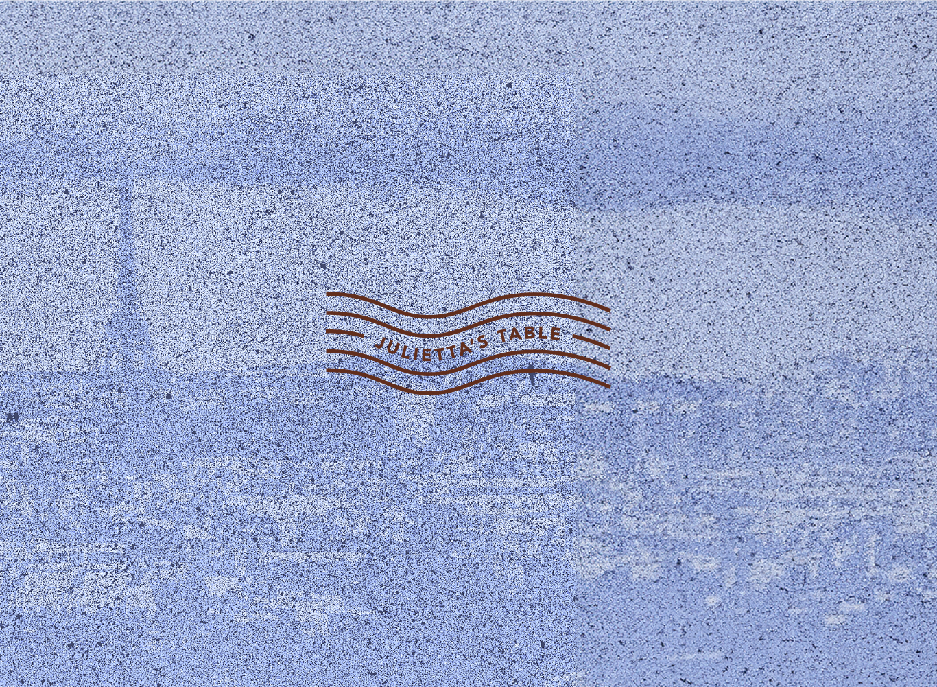
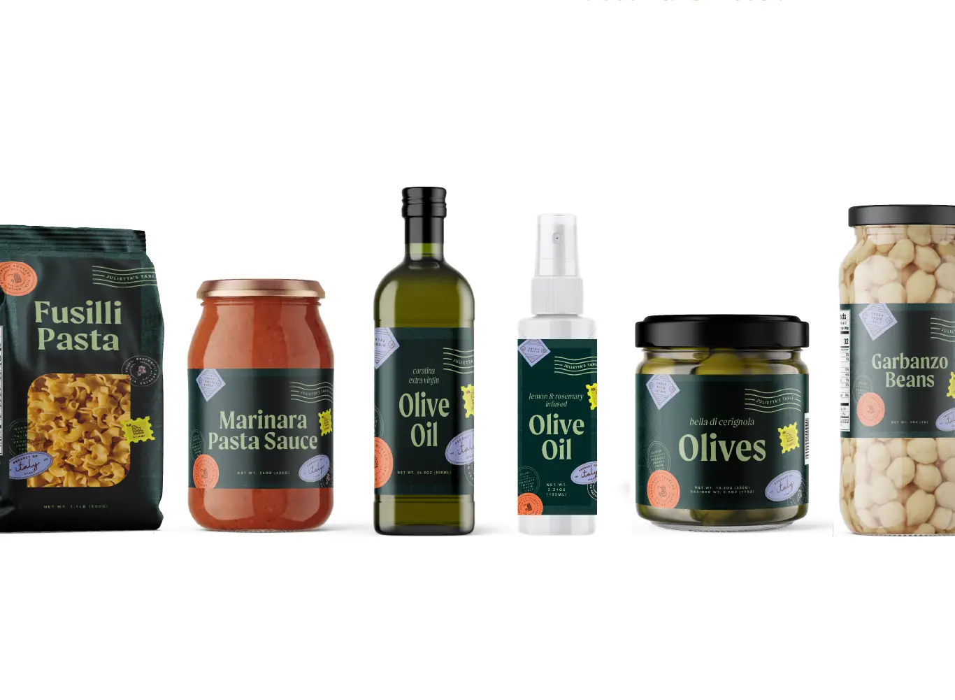
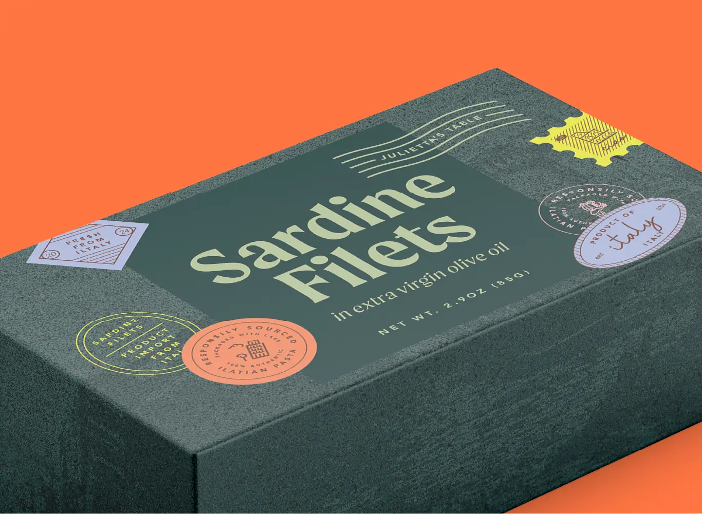
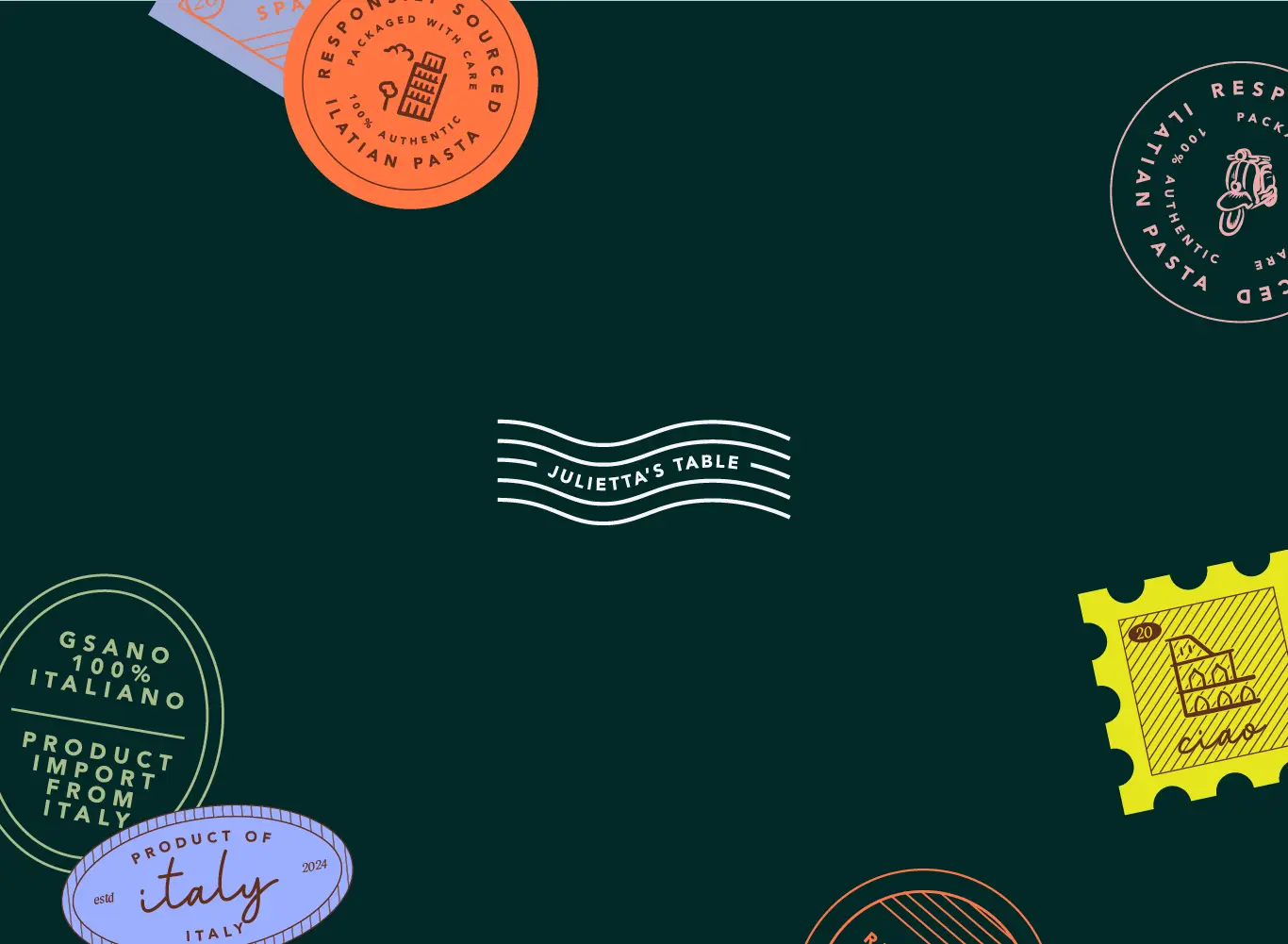
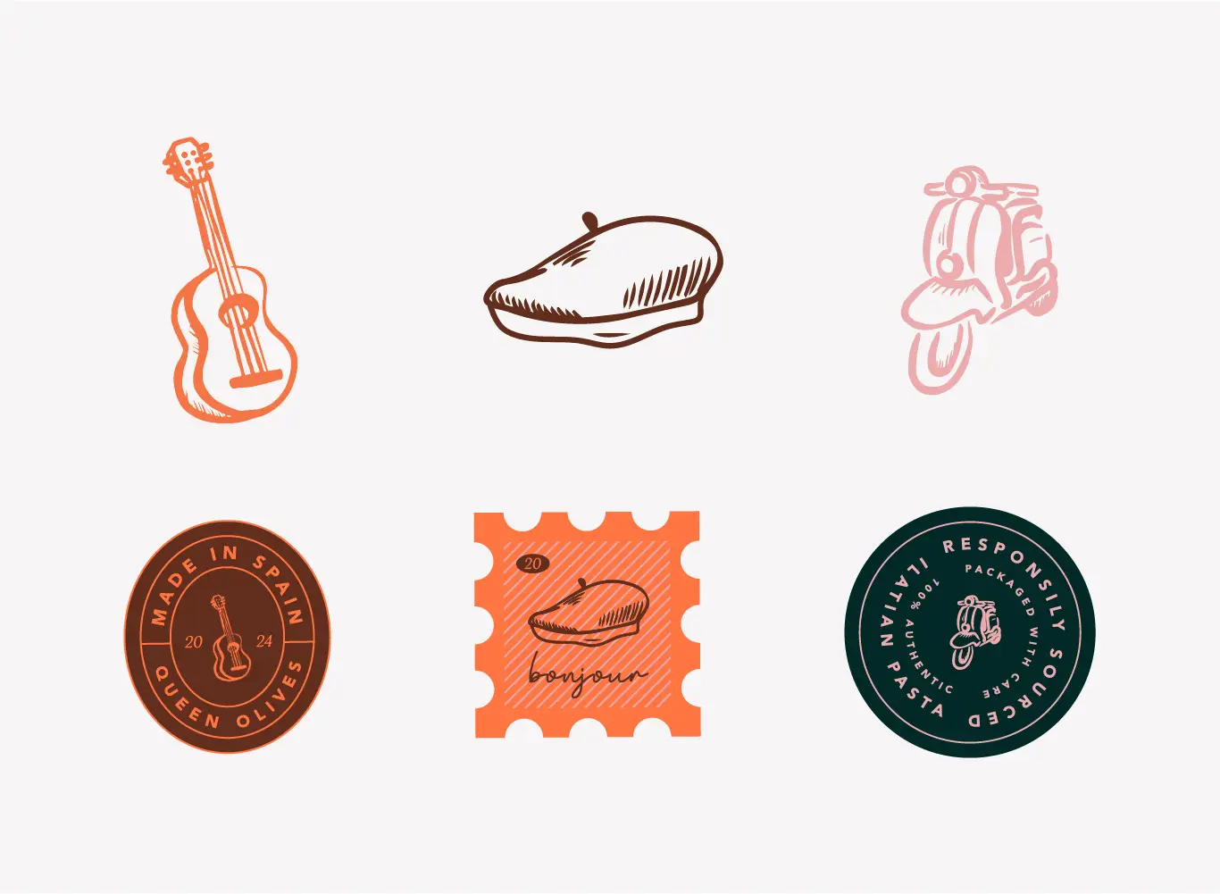
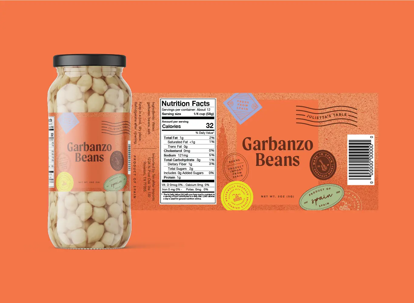
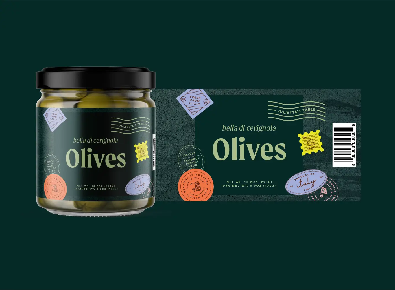
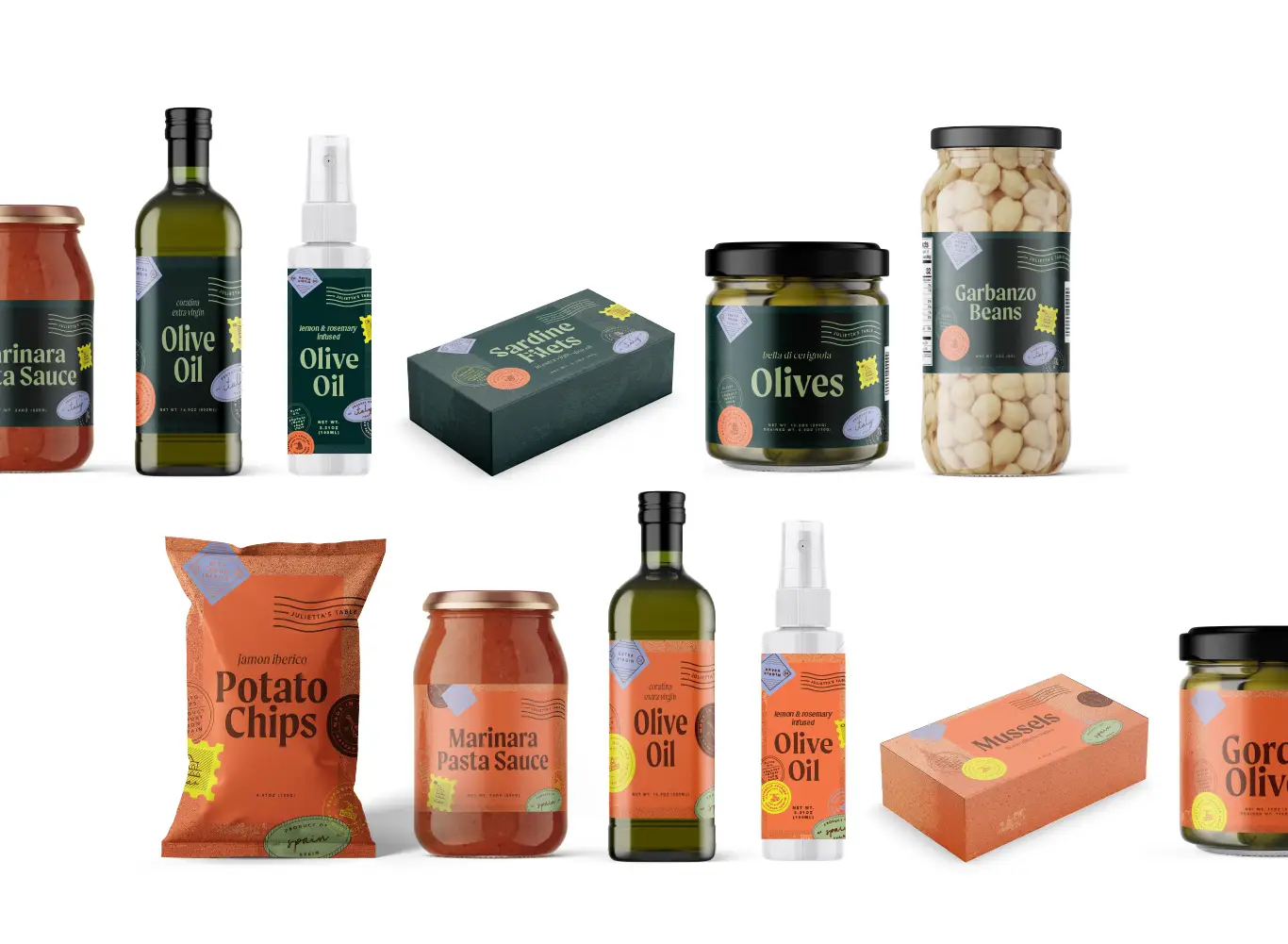
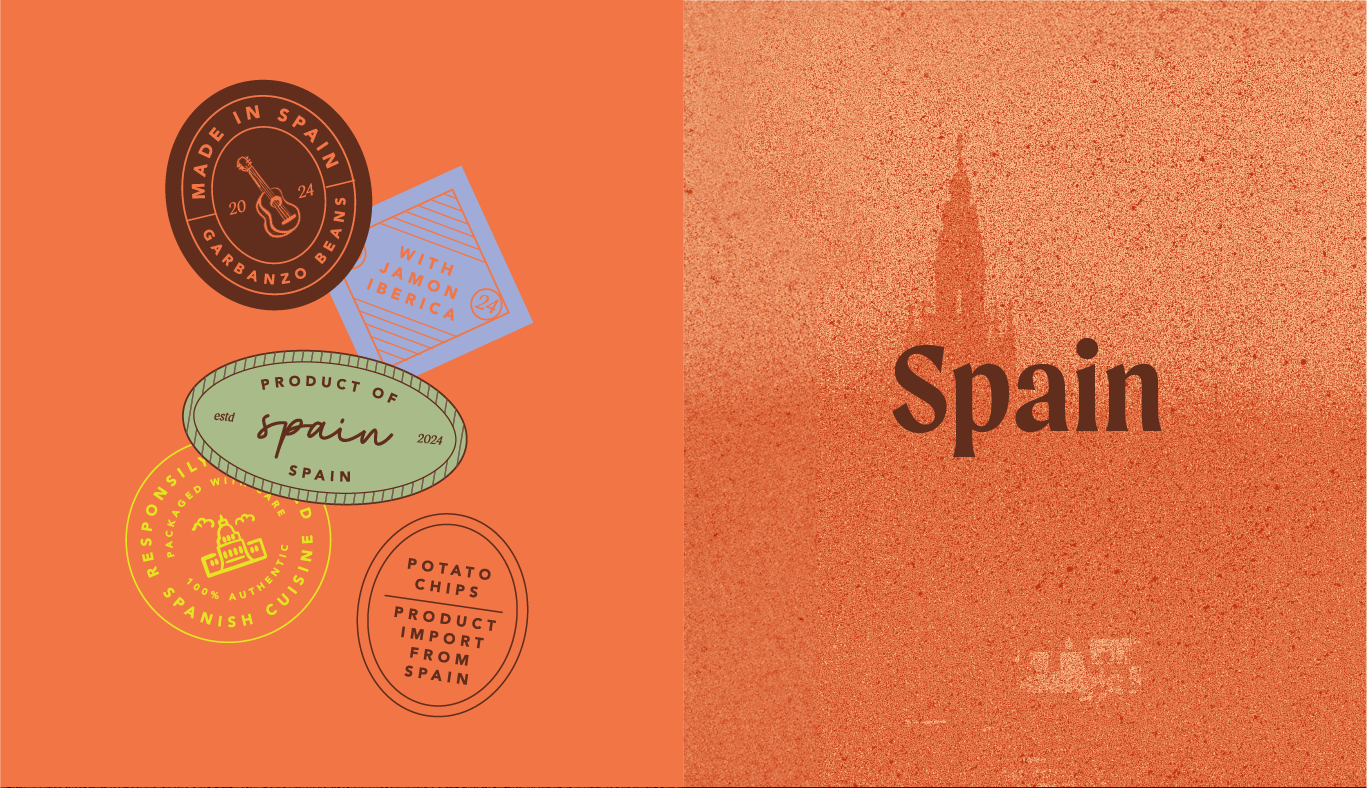
The client wanted to creative a cohesive packaging identity for Spanish, Italian, and French products. They wanted it to feel like a fun imported product with a heavy inspiration on stamps, hand drawn elements, and obvious but not traditional colors.
The biggest challenge was getting the colors right. Their main goal for the shopper was for them to recognize it’s a brand of imported goods from these three counties. Secondly, of course to stand on out on the shelf in terms of being different and fun but remain easily recognizable as far as where the product is imported from.
With each countries colors in mind, a brighter, more saturated palette and hand drawn stamp elements, they were on board with mixing each countries throughout the three locations to create a brand cohesion.